Square
UX Case Study
Jr. Digital Product Studio - University of Utah
Systems Design, UX Design, UI Design
(October 2017)
[ view the full presentation here. ]
A simple visual indicator to solve numerous customer complaints, and make a bit of extra cash.
Square is a company dedicated to making the economy accessible to everyone. From easy-to-use credit card processing units, to POS (Point of Sale) units and full in-store setups, to small business loans, and even consumer-to-consumer money transfers. Square makes it easy for small businesses to grow with limited resources.
Despite being a highly rated company, the only complaint has to do with their algorithm that decides whether or not an account is at risk due to a large influx of sales. My thought was to make that threshold visible and allow users to pay a small fee to temporarily circumvent that process, providing security to business owners, and compensating for any risk that Square may face.

Note:
If you’re at all familiar with Square, you’ll see right away that the UI looks nothing like the current UI, part of the assignment for this project was to build the experience using Adobe Spectrum UI, so it’s going to look a little odd, don’t be surprised.
The problem.
My objective was to find a problem with Square's web app that could then be fixed to improve user experience and monetized to incentivize the company to make the change. Unfortunately, Square is highly rated by big and small businesses alike, but they aren’t impervious to issues.
Despite the focus on small businesses, small businesses were becoming frustrated when they discovered their accounts were locked after even just one high-traffic day in their store, which seems unusual. Below are all reviews from the Better Business Bureau describing the same problem, time and time again.
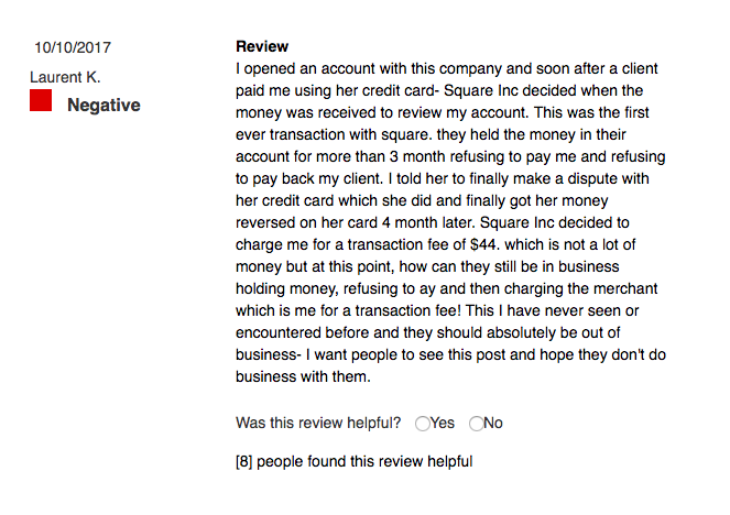
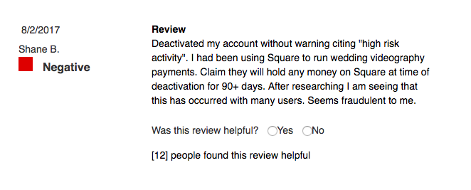
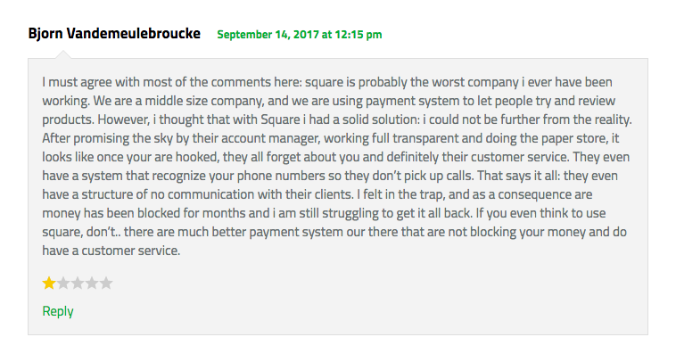
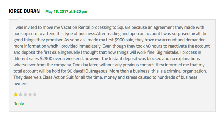
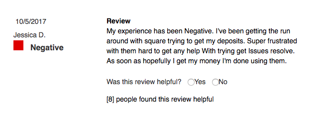

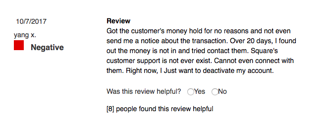
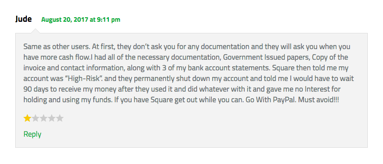
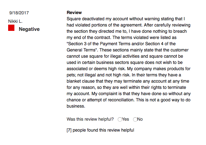
A selection of negative reviews for Square from the Better Business Bureau (click to enlarge)
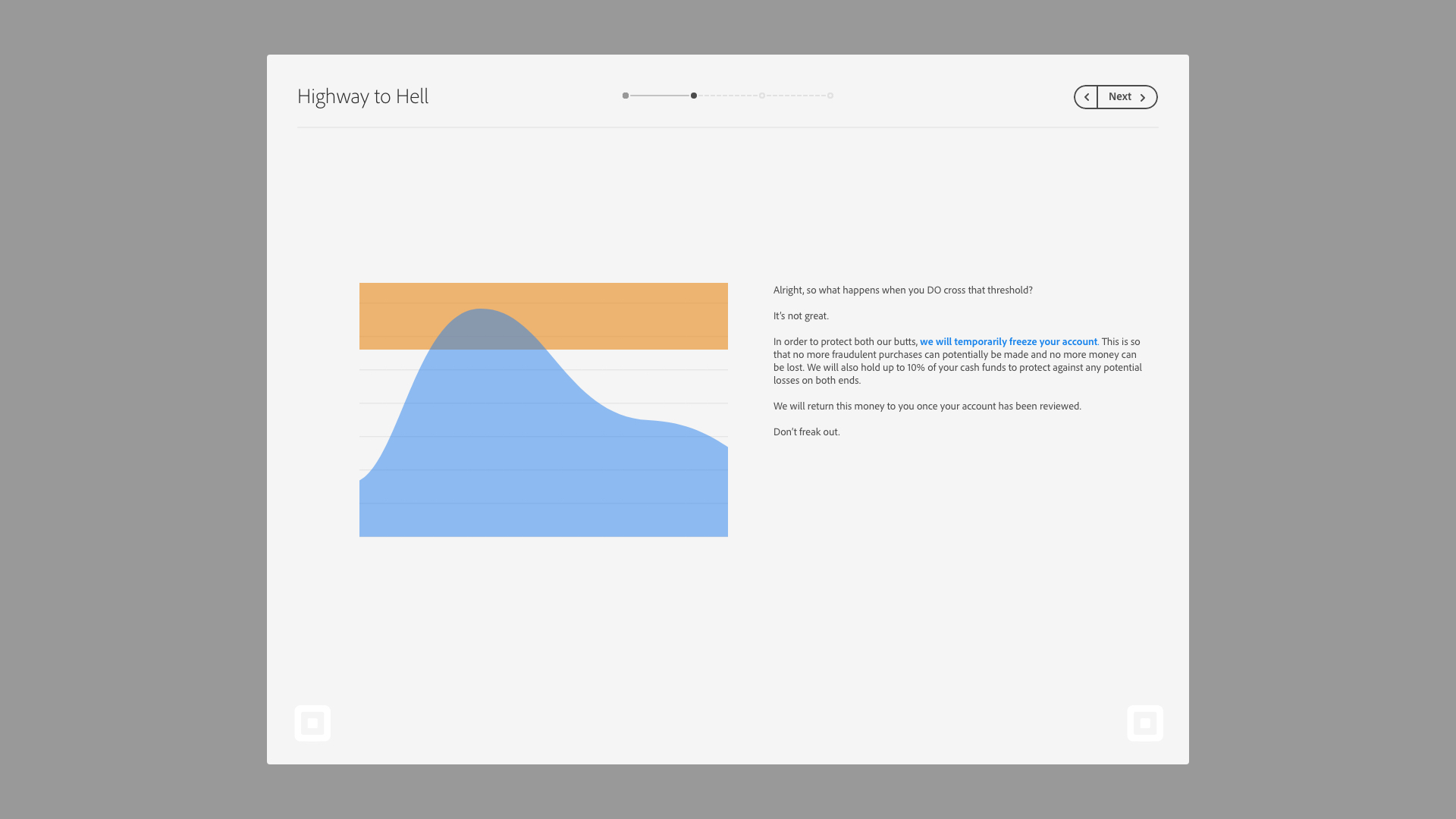
The problem, I discovered, was due to an internal security feature:
When a seller’s revenue is much higher than usual, Square will automatically lock your account to check for fraud, making sure no funds are being manipulated.
This feature was developed specifically to help small businesses not to lose money, but when their account is locked, it can take up to a week to clear up. And while your account is audited, account owners have no ability to access their account, transfer funds, or even receive payments from customers. A fairly large blow to small businesses when day-to-day transactions make a difference.
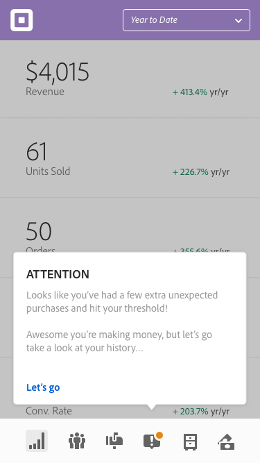
A simple solution: transparency.
So if the problem is one of transparency, why not show customers what’s going on? Then far fewer people will be at fault if something goes wrong.
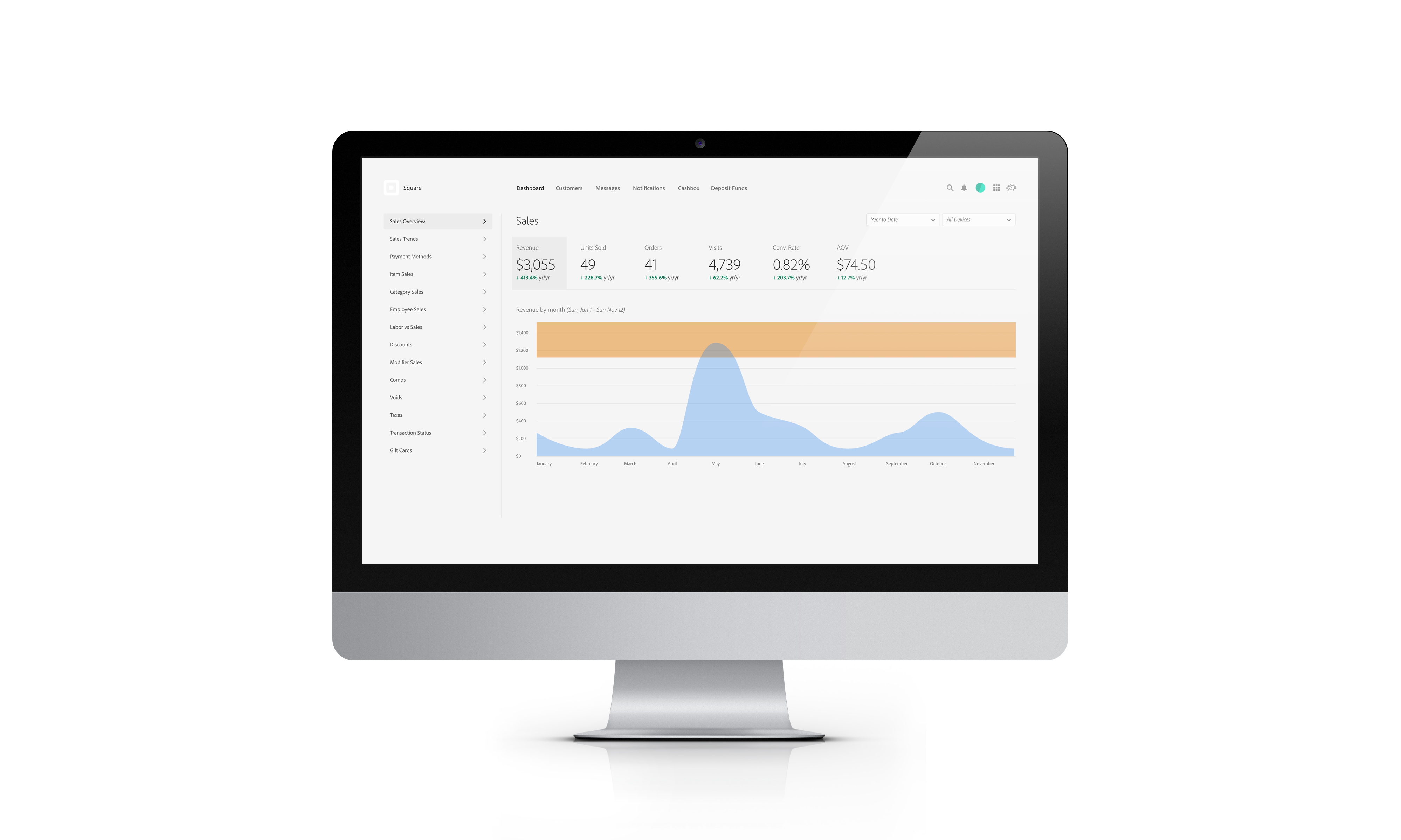
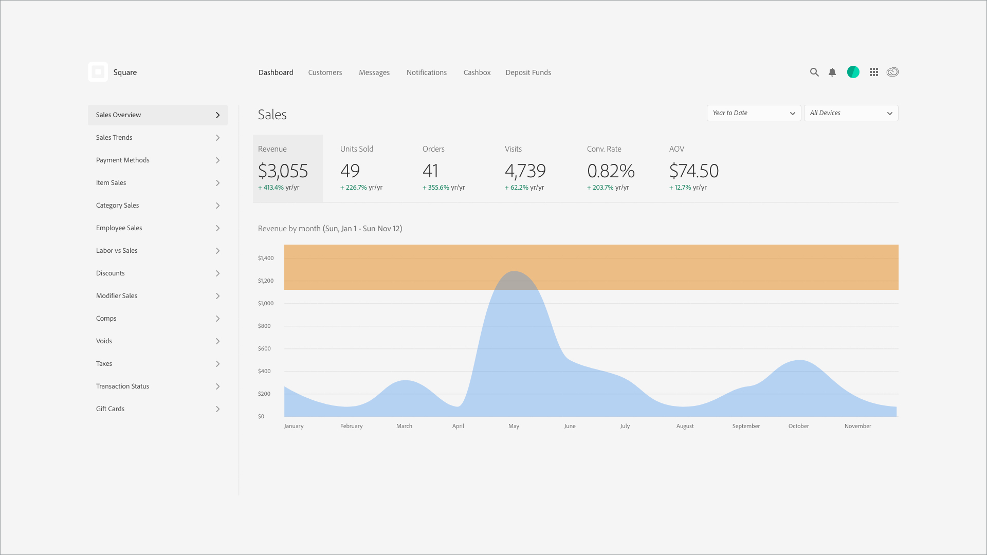
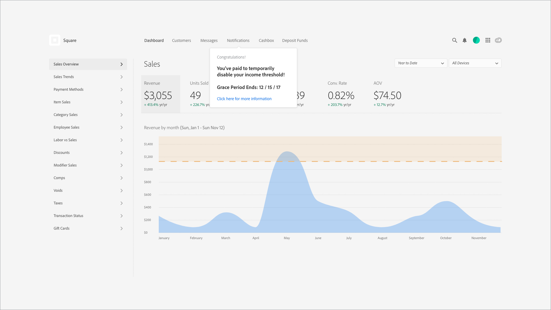
Revised Dashboard
The problem is the limit determined by the algorithm, so with this revised dash, that limit is shown in orange.
Explanation
Explain the problem to the users via a simple pop-up or dialogue box.
Explain the problem to the users via a simple pop-up or dialogue box.

Education
Next would be teaching them why this is the solution that Square has introduced.
Next would be teaching them why this is the solution that Square has introduced.
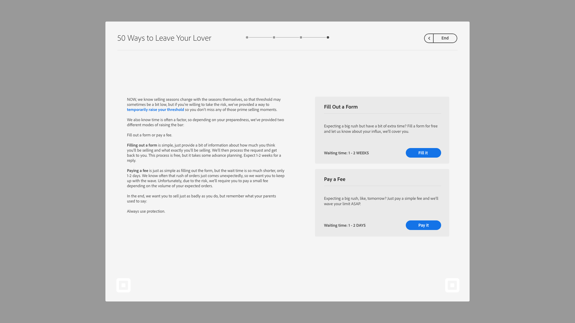
Give Them Options
After educating users on the problem and the potential solutions, give them options on how to fix it. The first option being the standard method, filling out a form and waiting the allotted time. The second option would allow for users to pay a small fee to supercede the imposed limit for a short period of time.
After educating users on the problem and the potential solutions, give them options on how to fix it. The first option being the standard method, filling out a form and waiting the allotted time. The second option would allow for users to pay a small fee to supercede the imposed limit for a short period of time.
Show Them What’s Changed
After allowing users to circumvent the limit, when they arrive back at their dashboard, they should be able to visually see what’s different and how long they’ve got with this new freedom.
After allowing users to circumvent the limit, when they arrive back at their dashboard, they should be able to visually see what’s different and how long they’ve got with this new freedom.
Educate Them Even More
As users progress through this week of freedom, it’s crucial to continue and show them what’s going on. Both in terms of sales they are making, but also to show the types of things that Square’s algorithm is searching for in terms of fraud.
As users progress through this week of freedom, it’s crucial to continue and show them what’s going on. Both in terms of sales they are making, but also to show the types of things that Square’s algorithm is searching for in terms of fraud.

Give Them Access
Lastly, these types of notifications need to be accessible on their phones, we live in the modern world, so making sure they can see what they need at any time of day will really make the difference.
Lastly, these types of notifications need to be accessible on their phones, we live in the modern world, so making sure they can see what they need at any time of day will really make the difference.


Closing thoughts.
My goal as a designer is to help provide clarity and transparency for users, and when it comes to a company and a product like Square, one I’ve used in my own startup as well, I want to do nothing but help improve an experience that already helps so many small business owners all over the world.
Hopefully this does the trick.