Yellowstone:
Gaps in Translation
Senior Research Studio - University of Utah
Systems Design, UX Design, UI Design, Product Design
(Fall 2018)
[ full press-kit ]
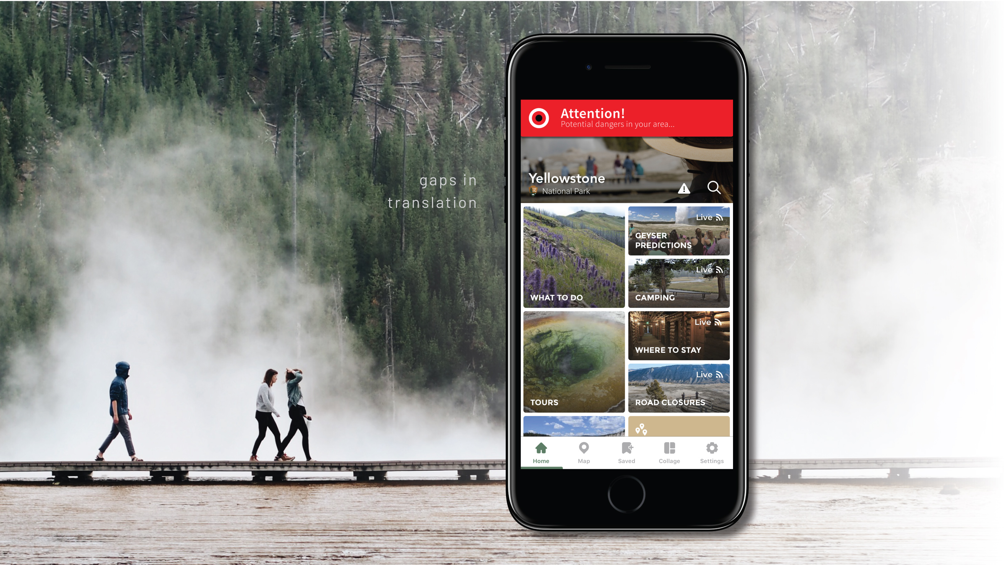
A new visual language–not dependent on one’s spoken language–designed to communicate danger and information to users at the right time via the Yellowstone app, and made possible by simple, non-invasive installations throughout the park.
Working in partnership with Yellowstone Forever, the official non-profit arm of Yellowstone National Park, the focus of my semester came from issues I observed while we spent a week at the park, speaking with park rangers, educators, and facilitators. My main focus was really surrounding the issue of safety for all visitors, especially the quickly growing group of international visitors who may not understand the potential dangers of the park, due to a gap in translation.
Combining this new visual language with the existing Yellowstone National Park App, I devised a new system to help push information to park visitors that not only increases awareness and safety for them, but for the local wildlife, local environment, and the park as a whole. What’s even more fun, is the entire system could be implemented with minimal physical changes to park infrastructure, and low costs to the park.
Initial feedback from Yellowstone has been very positive and they are “looking forward to discussing the project further about potential applications in the park”.

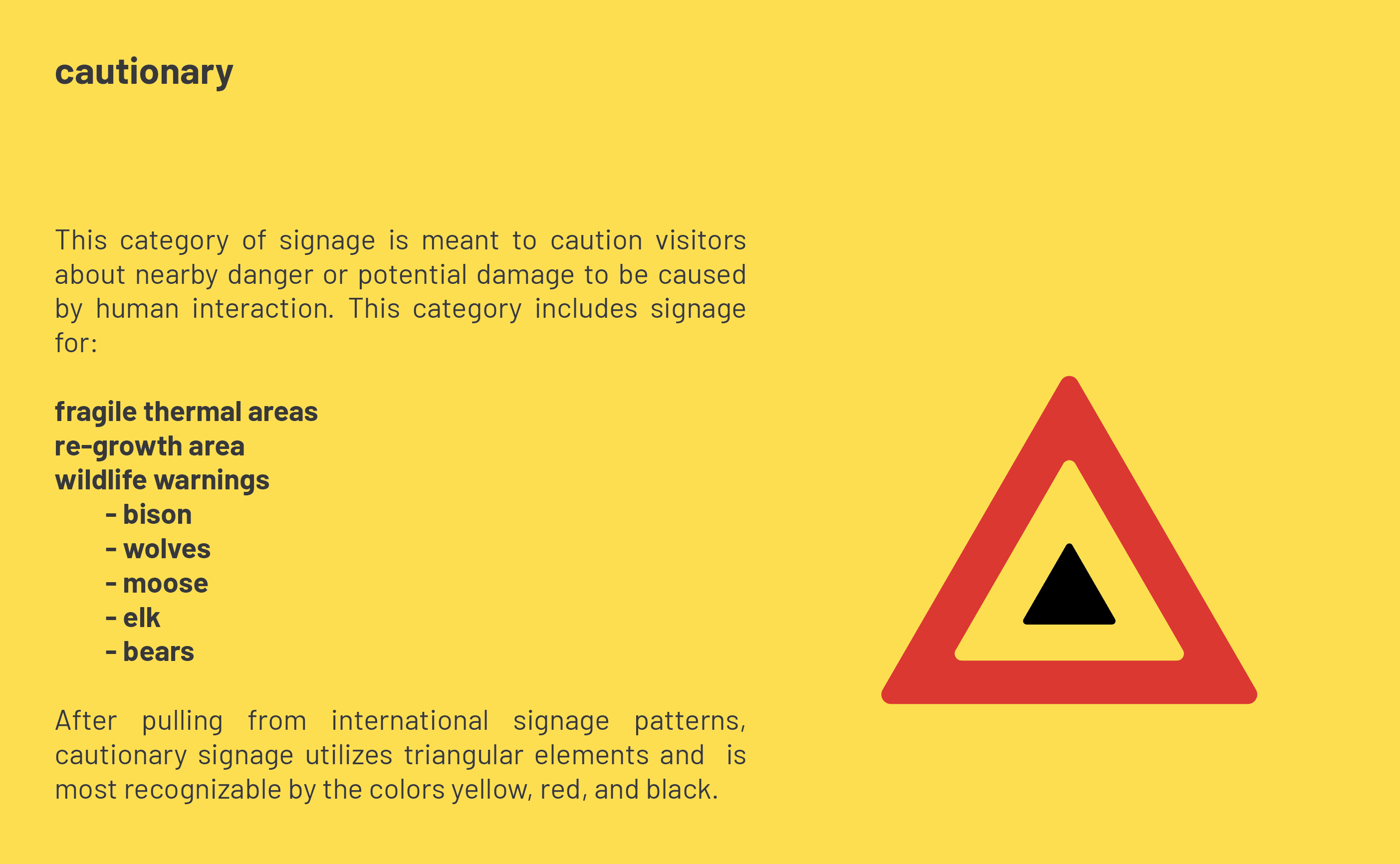
Cautionary notifications
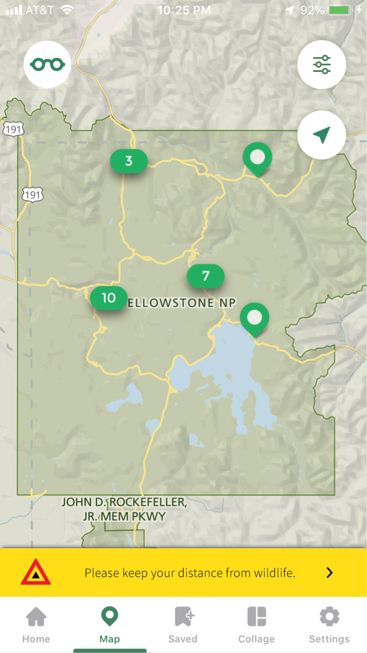
Utilizing more subtle notifications, this app integration will remind park visitors of the dangers of wildlife and fragile ecosystems near their current location, thanks to BTLE (Bluetooth Low Energy Beacons) placed strategically near park attractions.
Technology
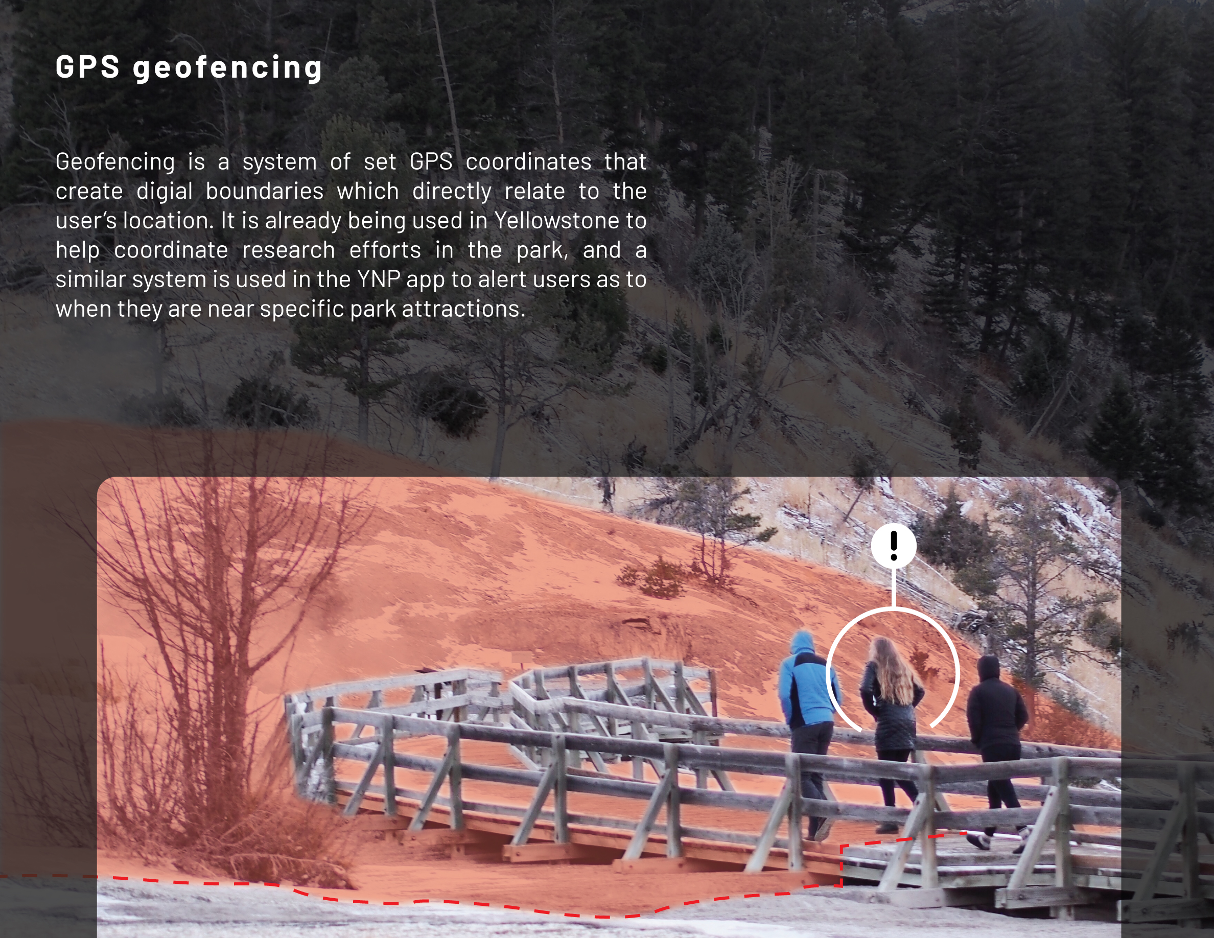
Geofencing is a system of set GPS coordinates that create digial boundaries which directly relate to the user’s location. It is already being used in Yellowstone to help coordinate research efforts in the park, and a similar system is used in the YNP app to alert users as to when they are near specific park attractions.


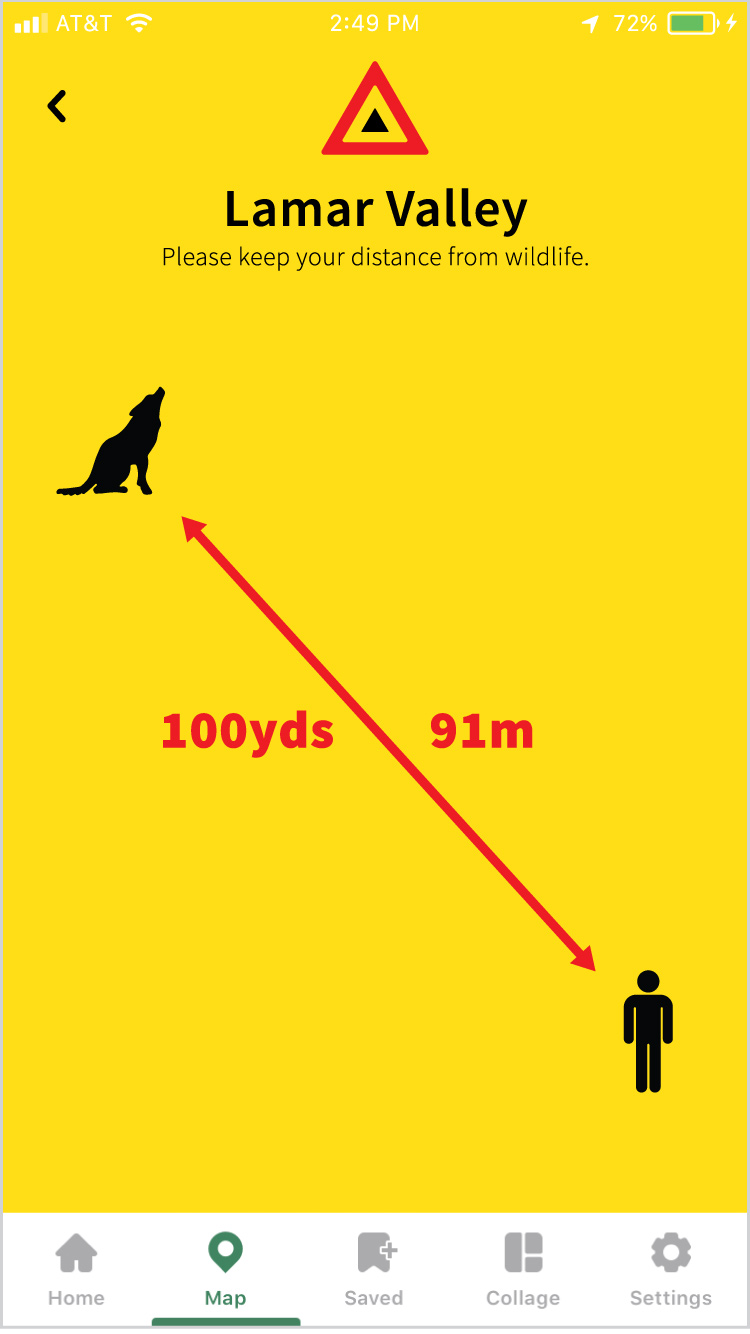

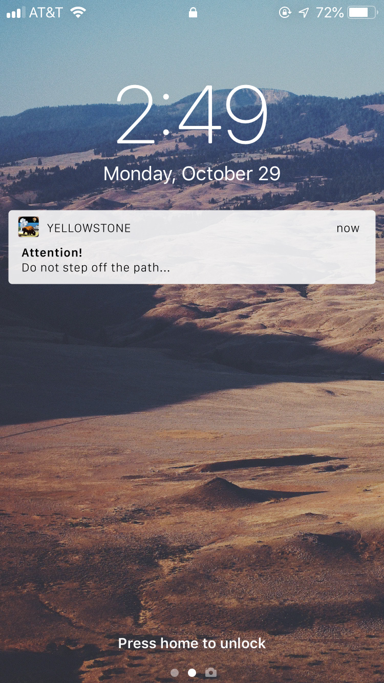
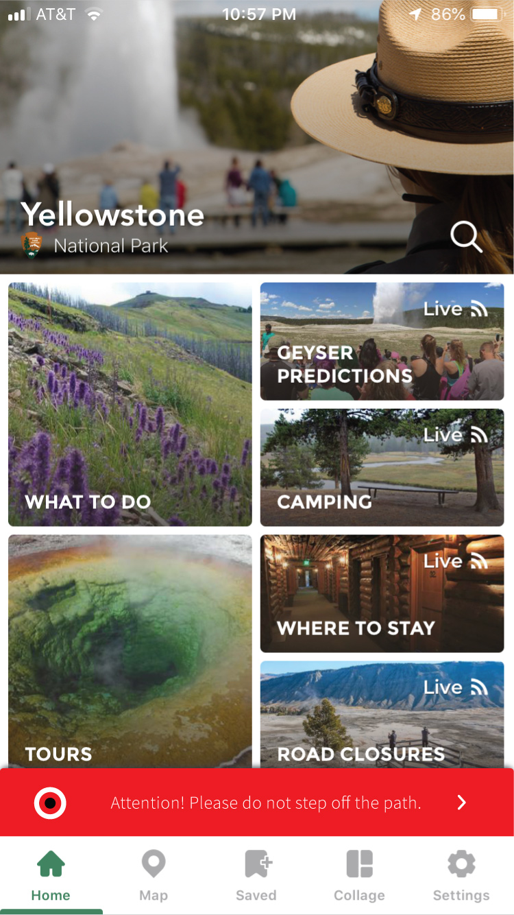
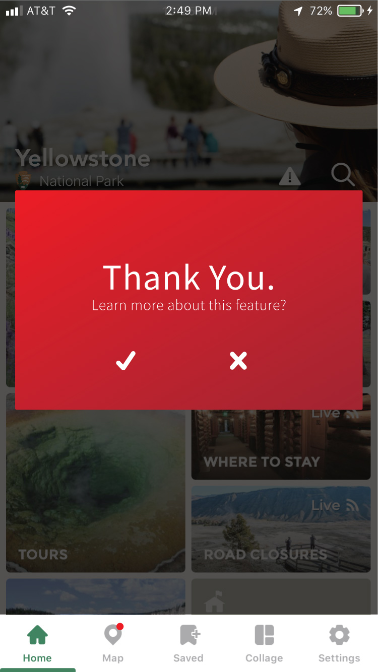
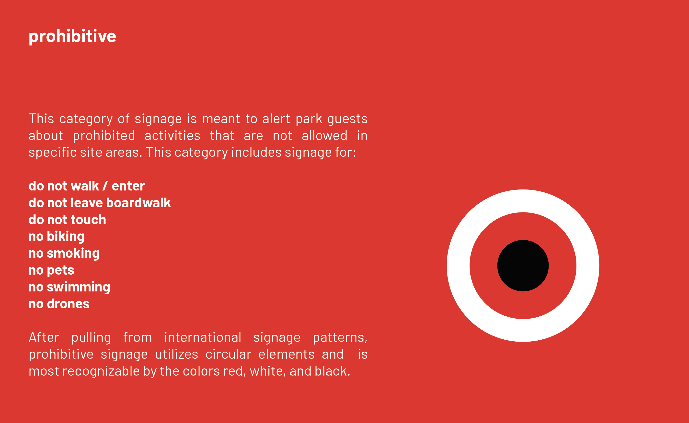
Prohibitive notifications
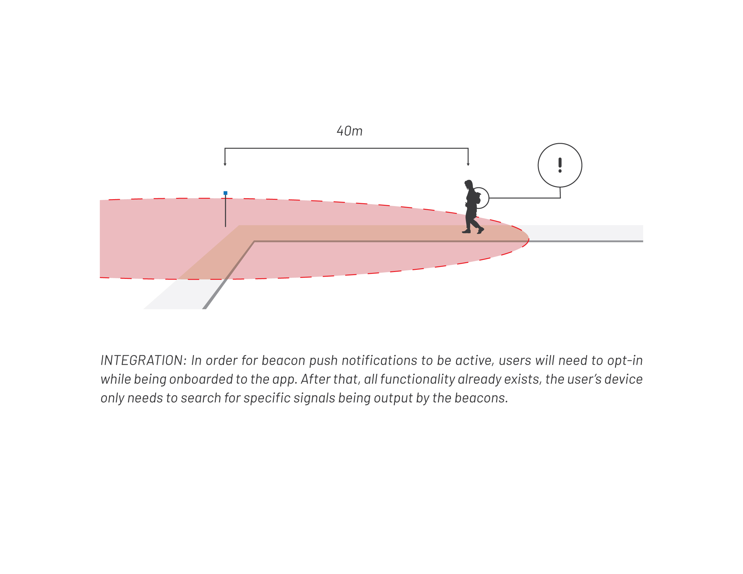
Integrated push notifications based off of a visitors location within the park will serve as the most important line of defense for both visitors of dangerous park attractions.
Technology
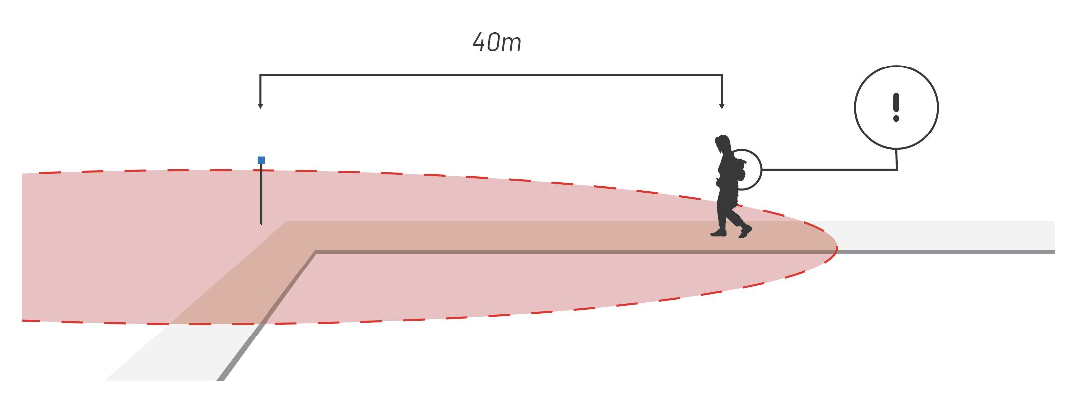
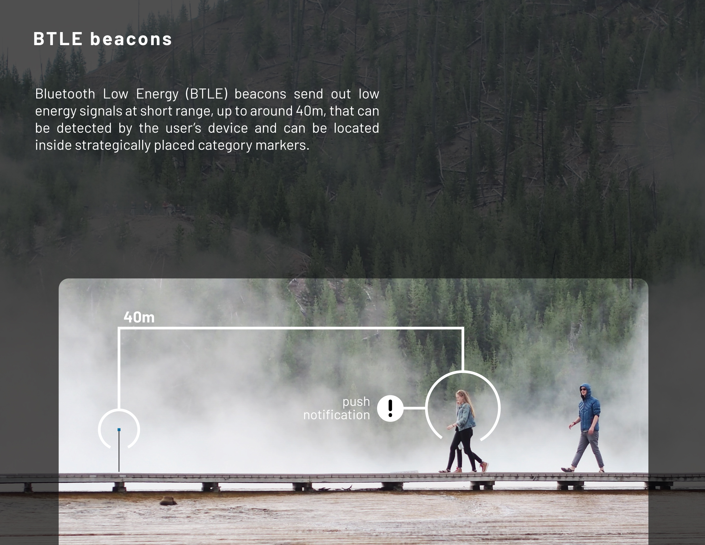
Bluetooth Low Energy (BTLE) beacons send out low energy signals at short range, up to around 40m, that can be detected by the user’s device and can be located inside strategically placed category markers.


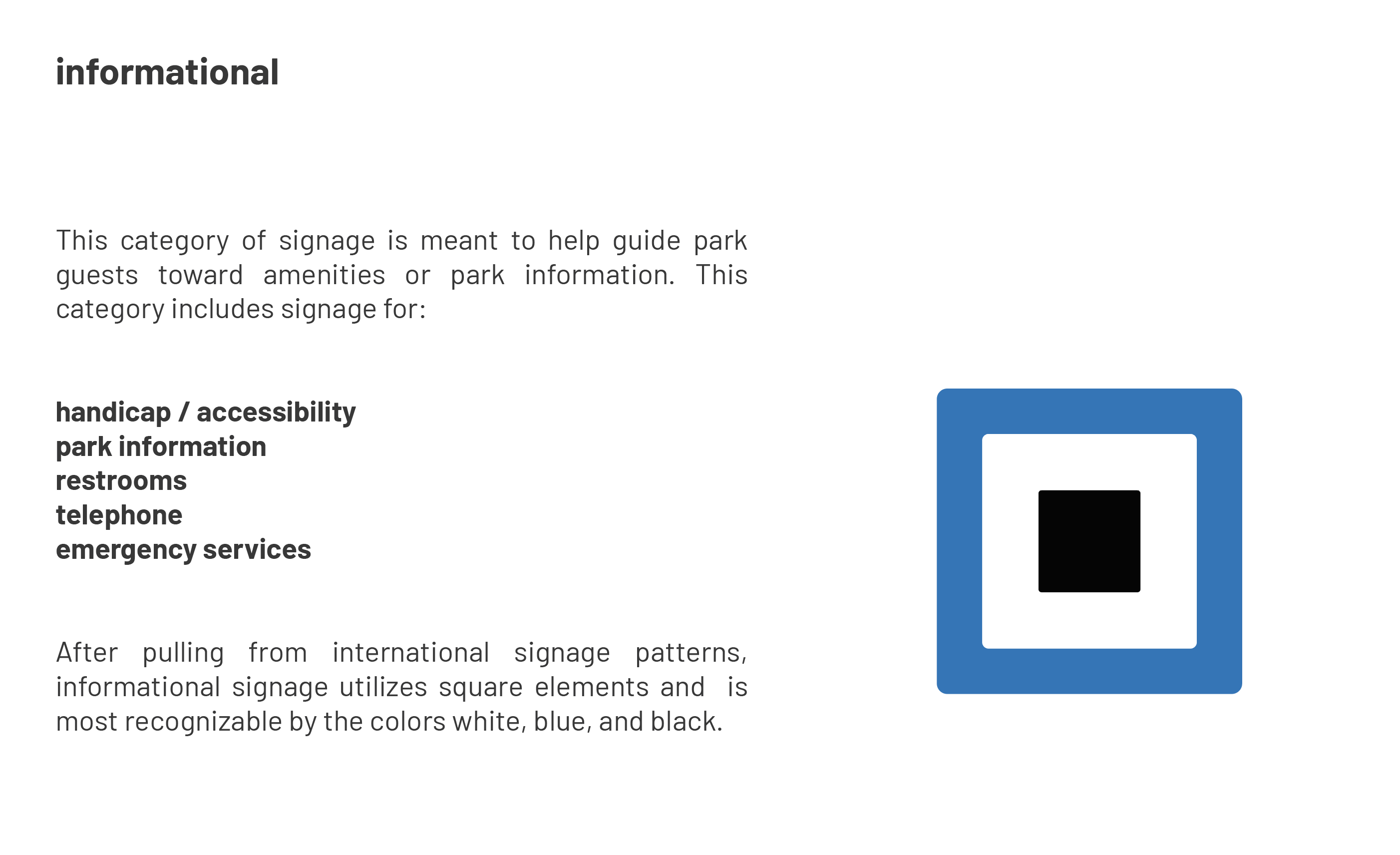
Informational notifications
When park visitors are looking for additional information regarding park attractions, they can utilize their smartphone to instantly learn more about where they are and what’s nearby.
Technology
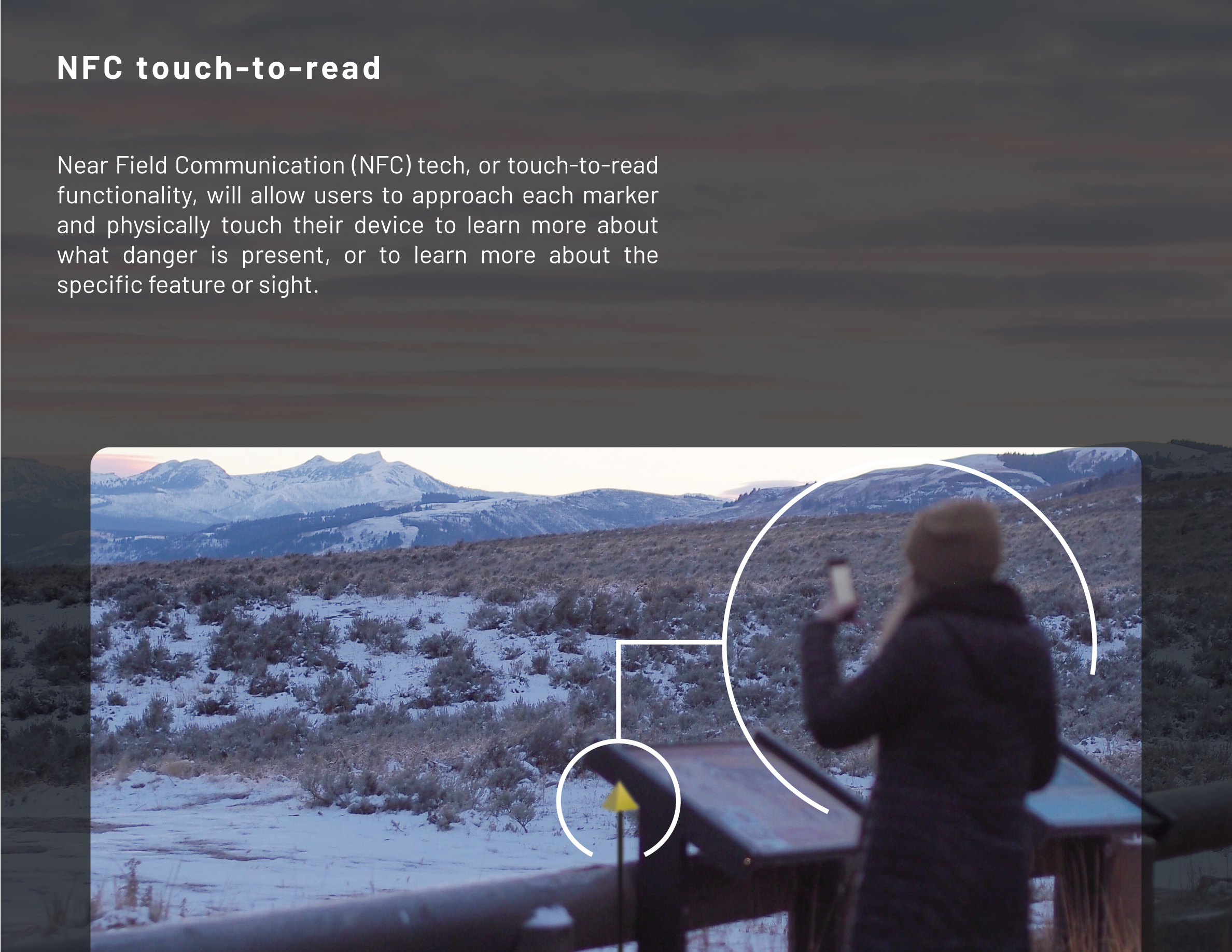
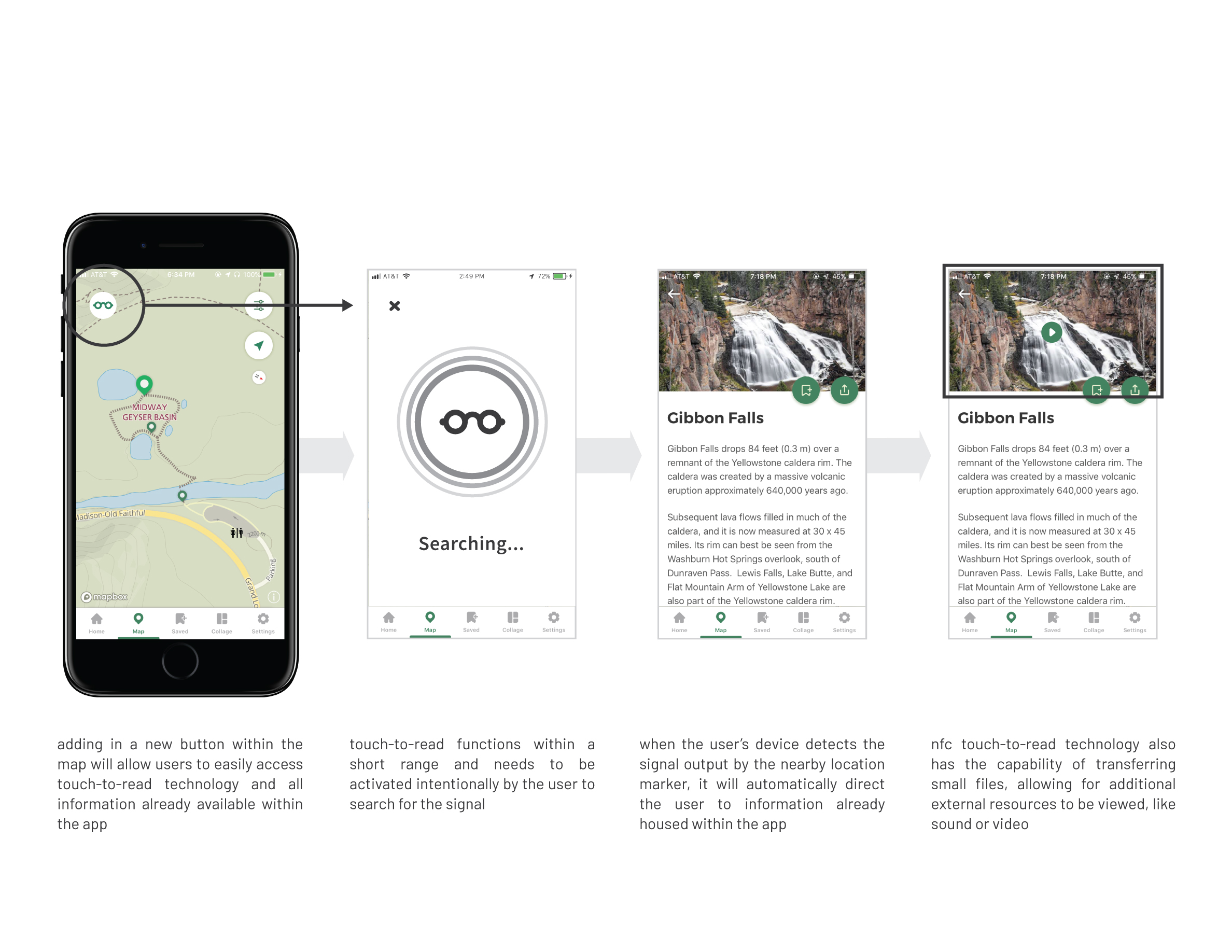
Near Field Communication (NFC) tech, or touch-to-read functionality, will allow users to approach each marker and physically touch their device to learn more about what danger is present, or to learn more about the specific feature or sight.


Gaps in Translation.
With such a wide diversity of visitors coming to Yellowstone every year, there is no guarantee that there will be a cohesive understanding from park visitors about the safety and behavior guidelines of the park, due to general cultural and language barriers.
A new visual language designed for mobile devices that isn’t dependent on the user’s native language, echoed also through physical signage placed throughout the park, will likely have an affect on the greatest number of visitors.
This language used in combination with current location-based technology available for mobile devices will help to greatly increase visitor awareness for safety, and provide new avenues for information to be directed to park guests.

Statistics provided by Yellowstone Forever
How people see signs.
A design is only as good as it’s impact on the user, so how do you make the information stick? My goal was to create a solution for as many park visitors as is possible, but what’s the use if they don’t remember it?
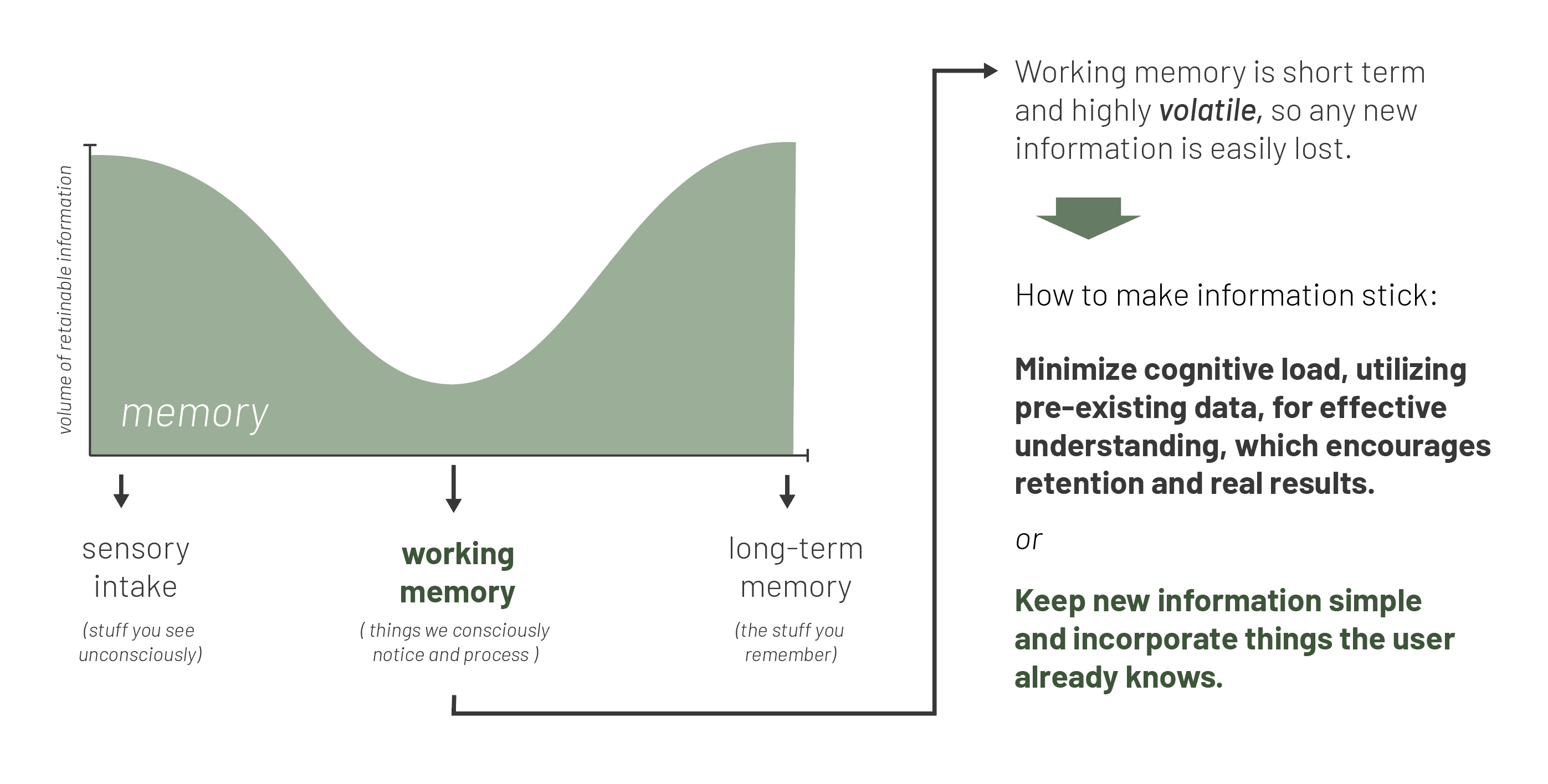
Classifications of memory and volume of retention
Park audit.
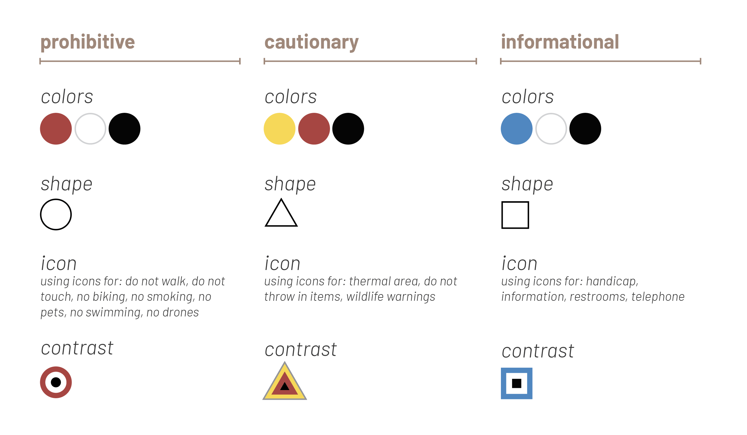
In order to most effectively reach the largest number of visitors, I performed an audit of signage from across the world, looking for commonalities in color, shape, and icon. From there I created a new set of visual standards, not dependent on spoken language, that helps identify three categories of signage in the park: prohibitive, cautionary, and informational.

A look into my research of signage and iconography both inside Yellowstone National Park, and the top countries supplying visitors to the park. (click to enlarge)
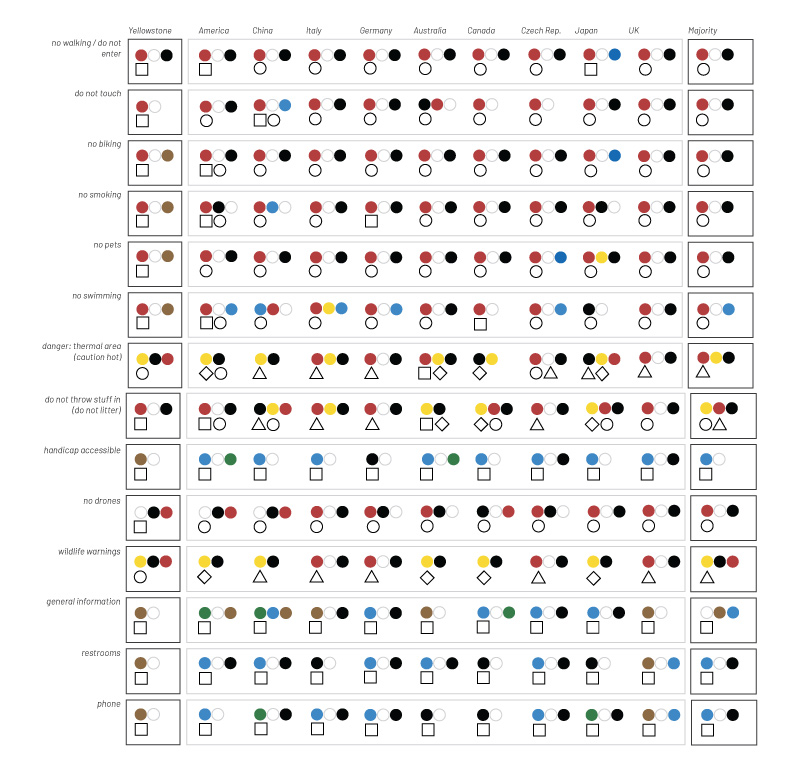
After auditing the signage, I distilled down major shapes and colors for each category of signage in each of these countries. (click to enlarge)
A new visual language.
Taking into account international signage patterns, signage patterns within the park, and the existing Yellowstone application, I designed a new visual language specifically for mobile use to highlight three categories of information:
Taking into account international signage patterns and the existing Yellowstone application, a new visual language for warnings can be designed for mobile use, while incorporating physical markers to drive home the visual reminder of each category of signage.
Using the three categories mentioned above (prohibitive, cautionary, and informational), basic design elements can be assigned to each category with the intent of alerting the greatest number of visitors possible to specific dangers and pieces of information. This is done not only through the integrated changes on the mobile app, but is also echoed through physical markers designed through the same system that will be strategically placed near trailheads and on pathways, according to their meaning.
Park implementation.
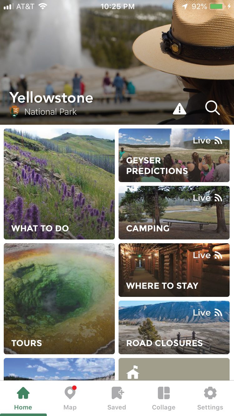
In order to keep up with the evolving visitor population, YNP designed and released an app as a resource to help visitors be more connected with the park. It allows for visitors to view a map of the park, learn about what sights to see, save and plan their trip, and be up to date with park closures and other important information.
The platform provides important online and offline functionality that allows for a comfortable park experience where cell service is limited, but is also open enough to allow for growth and expansion.
Utilizing the yellowstone app, making a few minor adjustments to help user flow, and providing a way for all users to access the app will help to create an effective tool for visitor experience.
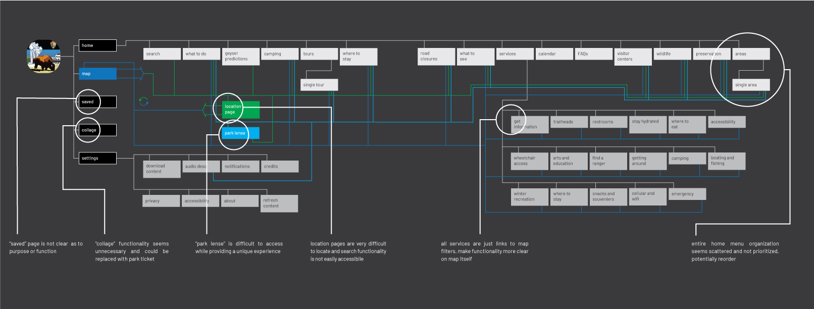
Existing yellowstone mobile app audit with identified opportunity spaces.
Underlying technology.
Each of these different technologies are all common tools used within various other tech platforms and smartphone applications, but utilized in the right way could greatly increase efficiency inside the park and help visitors despite a lack of cell coverage.
Locational case studies.
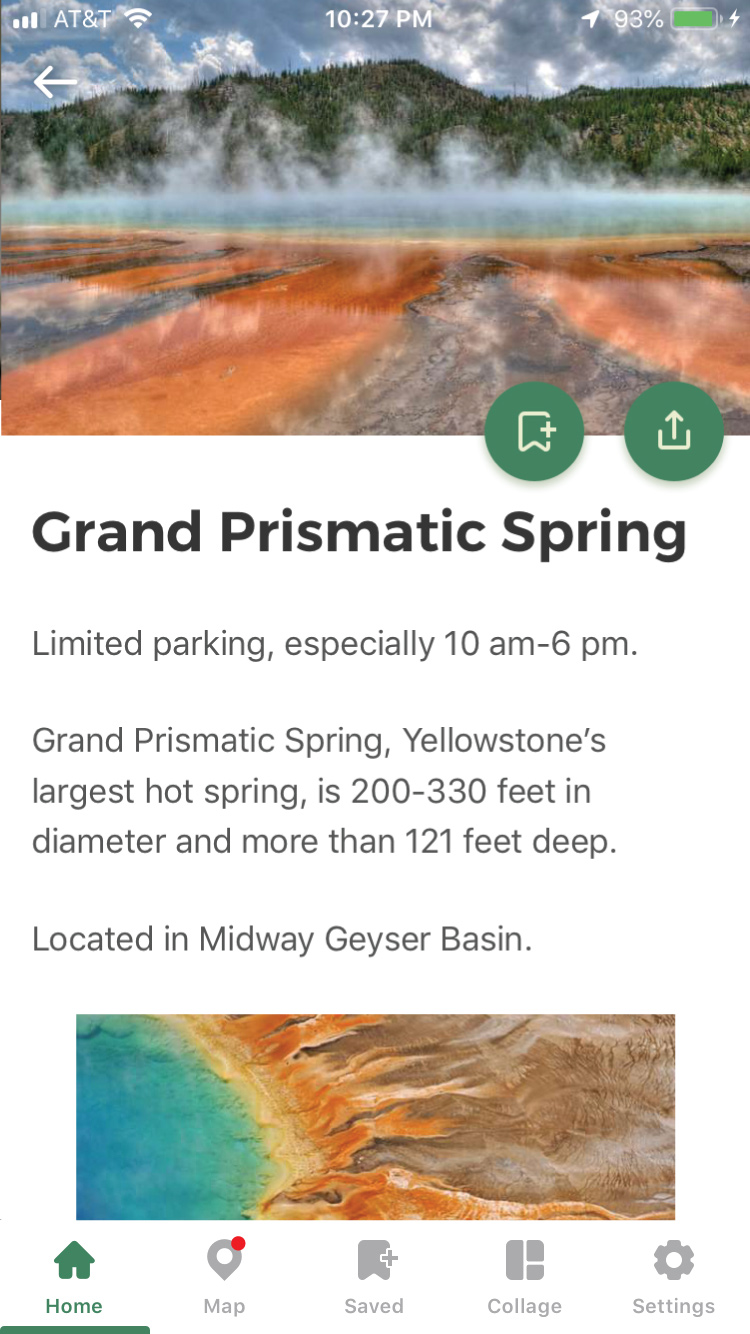
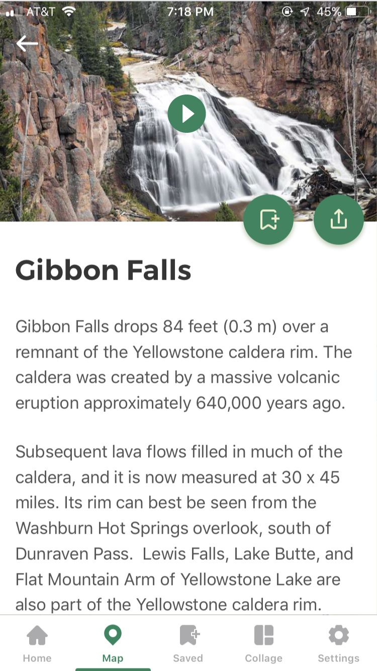
In order to best show how this entire system works together, I pulled together three different case studies based on some of the most popular attractions at the park: Grand Prismatic Springs, Lamar Valley, and Gibbon Falls. Each provide unique challenges for park staff, and unique dangers to park visitors, which is why I felt they were best used to fully demonstrate the system in action.
1.
Grand Prismatic Springs (3 slides)

2.
Lamar Valley (2 slides)

3.
Gibbon Falls (2 slides)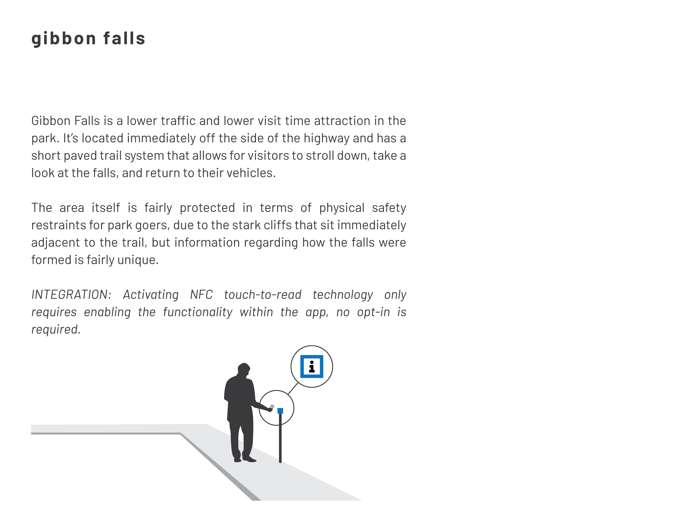
Conclusion.
Smart devices are now, and will continue to be, a part of Yellowstone National Park for the forseeable future. Utilizing these devices and each incorporated technology mentioned above is a way to ensure that YNP has the greatest chance of protecting not only park visitors–no matter where they originate from–but the entire ecosystem of the park and the wildlife within.